|
What is the Mandelbrot set?
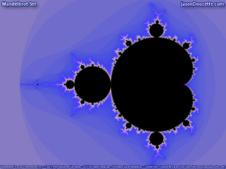
The Mandelbrot Set is a fractal named after its discoverer,
Benoit Mandelbrot.
Mandelbrot coined the term "fractal" in 1975 from the Latin fractus or "to break".
Fractals are things that are self-similar at various scales.
Magnification of a fractal will reveal small details similar to larger characteristics.
In the Mandelbrot Set, these small details do not replicate the larger whole exactly,
and thus it is said to have only quasi self-similarity.
The Mandelbrot Set is a fractal created by a very simple mathematical formula:
Zn+1 = Zn2 + C
It is an iterative process using complex numbers.
Given a number C in the complex plane, iterate the
above formula to infinity. If Z converges to a point,
it is in the Mandelbrot set. If it diverges (i.e. goes off
into infinity), it is not in the Mandelbrot set.
This implies there are only two possibilities
for each point in the Mandelbrot set. Each point is either:
1. in the Mandelbrot set
2. not in the Mandelbrot set
So, if we are drawing a picture of the Mandelbrot set,
where do the colors come from?
Shouldn't the image be black and white?
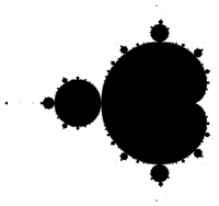
Yes, it should be. In fact, this is what it would look like:

But, that's boring.
We can create astonishing pictures by coloring all points that
are outside the Mandelbrot set
according to their proximity to the Mandelbrot set.
In other words, we color points outside of the Mandelbrot set
according to how close to the Mandelbrot set they are.
Besides, if we just colored it black and white,
a lot of beautiful images would be all white, since
often only a
minute, indistinguishable percentage of the image's area
is within the set (any of the images below that have
an absence of black areas are examples of this).
If we color the areas outside of the set, we are able
to distinguish which portions are closer to the set than
others, and it creates breathtaking patterns. Here is
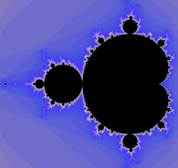
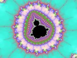
what the same image looks like with colors:

How can you tell how close to the Mandelbrot set a point is?
We can find this out by looking how quickly each point is divergent.
If it takes a lot of iterations to notice a point is divergent,
it means the point is almost in the Mandelbrot set, but
not quite. We color this a different color than
points that are really far away from being inside the
Mandelbrot set - those that are divergent right away.
The result is a smooth palette of colors that signifies
how close to the set each point is.
Why are the colors different in each picture?
The colors chosen for 'painting' these pictures are arbitrary
- they were just made up, and have no real significance other
than two similar colors represent places that are the same
distance away from the Mandelbrot set. By creating a smooth
flowing palette of colors, we can visualize portions of the
image that are all relatively the same distance
away from the Mandelbrot Set.
Why does every picture look different?
Perhaps the most amazing thing about the Mandelbrot set
is that it has infinite detail. You can zoom in
on any point with detail forever and get more detail.
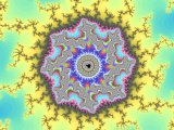
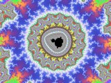
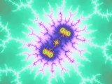
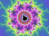
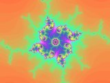
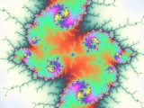
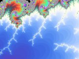
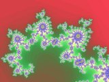
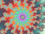
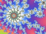
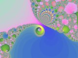
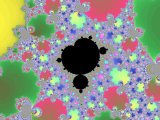
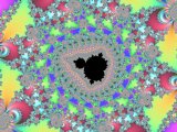
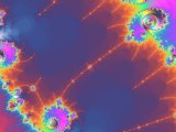
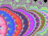
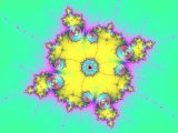
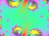
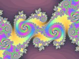
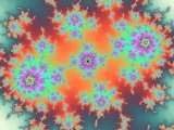
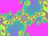
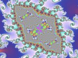
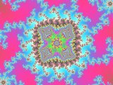
The images below are places I personally zoomed in on.
Some of the images are zoomed in sections of others -
if you look close enough, you will notice.
Why are there two links for each picture?
The first link ([Normal])
is the normal way Mandelbrot set images
are created - without any anti-aliasing. You will see lots
of graphic artifacts in these. This is not how
the image would look in real life, if it existed.
The second link ([Better])
is my method of creating Mandelbrot images,
which removes aliasing. I do this by supersampling.
I sample each pixel thousands of times to ensure
that it is the right color.
These images are the way you would see the
Mandelbrot set with your own eyes, if this were possible.
By comparing the two, you will notice a significant amount of
greater detail and clarity with my version.
The image files are huge! Why?
I can see some fuzziness when looking really close. Why?
I use the web standard .JPG image format to store these
images. Unfortunately, the .JPG format is lossy, meaning
that data is lost during the compression of the data.
While this is okay with most real life images, you can notice
unclear portions of this images if you look close enough
(when dealing with images of infinite detail, one tends
to look very closely at the detail of a single snapshot to find
more detail).
I have avoided data loss as much as possible by saving
the images in a high quality setting,
but these images still do not match the perfect
image data of the originals.
The original (perfect data) images stored in .TGA image format
range from over 550 KB to almost 2,000 KB in size.
In comparison, these .JPGs only range from 100 KB
to almost 500 KB.
|
